We've asked our supplier to look into overlapping bar graphs for seminar event overviews, similar to the area graph but without the connections between dates.
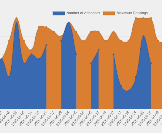
Category are session date, sources are number of attendees (maximum) & Event Maximum Bookings (Maximum). It gives a good overview of what upcoming sessions need to be advertised and what is close to capacity and may need to be expanded. But a non connecting overlapping bar graph would be better.
We also have a progress donut for Corporate training for learners on their dashboard.
Managers have a horizontal bar graph that stacks % certified against % not certified for each corporate training courses so they can see how their team is going.