
The content of this forum post has been removed and can no longer be accessed.
Best practice forum (Archived)
This forum discussion has been removed
This forum post has been removed
This forum post has been removed
The content of this forum post has been removed and can no longer be accessed.
This forum post has been removed
The content of this forum post has been removed and can no longer be accessed.
Re: Charts in General and Pie charts specifically
+1 for this. I fully agree and have same kind of experiences with graphical reporting.
For me, it seems to very tricky to get graphical reporting working.
Detailed instructions & simplified user interface is what I would really appreciate.
BR,
- Jani
Re: Charts in General and Pie charts specifically
For those who want to export the data and massage data outside of Totara, you might want to give Tableau a try. Hope this helps...
Re: Charts in General and Pie charts specifically
Hi Amir,
The problem you are experiencing here is a limitation of the "Group by" clause in SQL. If you use 2.7.7 with the settings you mention then the warning appears "This report is using data aggregation internally, custom aggregation of columns may produce unexpected results." which is basically saying the report is trying to aggregate data which has already been aggregated - not necessarily in the columns themselves but in other columns in the tables which are used internally by Totara.
I think with this report source its only possible to use one data source. What the graph appears to be plotting is the count unique (1 for yes & no) against the number of records set by the category - so 1/4 = 25%.
regards,
George.
This forum post has been removed
The content of this forum post has been removed and can no longer be accessed.
This forum post has been removed
The content of this forum post has been removed and can no longer be accessed.
Re: Charts in General and Pie charts specifically
Hi Amir,
I have already bought this up in another post back in May https://totara.community/mod/forum/discuss.php?d=10287.
In short Totara have hard coded the height of the graph area which stops some graphs being shown fully.
David
This forum post has been removed
The content of this forum post has been removed and can no longer be accessed.
Re: Charts in General and Pie charts specifically
Hi folks,
Apologies for the delay in getting back.
There is a video here that walks through a few report examples: https://www.youtube.com/watch?v=96cgVH9aJtM
Another vid showing bar graphs with course completion, but could be adapted to program completion by organisation: https://www.youtube.com/watch?v=FGDhAp1orCA
The issue with aggregation and report sources is a thorny one - we couldn't build in functionality for all possible use cases given the flexible nature of the reports (in 2.7.7 there are warnings which tell you if the data you are trying to aggregate is already aggregated).
When using Graphical reporting the trick is to use data sources which are capable of being rendered in a graph - its very much like the graphical reporting in Excel, the best way to understand how it works is to look at the SQL
hope this helps,
George.
Re: Charts in General and Pie charts specifically
Hi Amir,
In answer to "1. How to set up a pie chart showing program/certification completions" I set this up by using a report based on the "Certification Completion " source. I used the "User ID Number" column (because its a unique identifier for every user) and set the Aggregation to "Count". I also used the "Is certified Column". Then I set the Category under the Graph tab to "Is Certified" and used the Count of User ID Number" as the Data Source, The same settings will work for "Program Completion".
Its not possible to produces graphs using the criteria you mention in points 2 & 3 - the report source doest lend itself to aggregation in 2 & the functionality isnt available for 3.
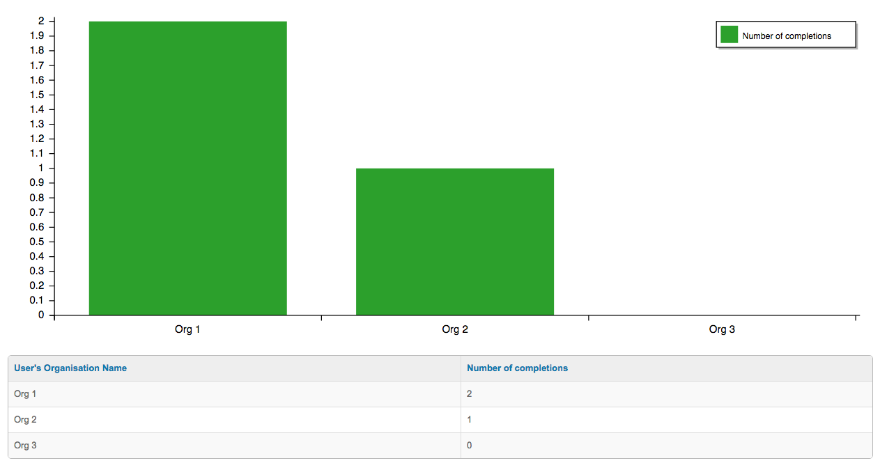
In answer to "4. How to create a bar chart comparing completion of programs between organizations" I used the "Program Completion" report source. I used two columns - "Is complete?" (aggregation set to count) & User's Organisation name. I set the graph type to "Column" the category to "Users Organisation" and the Data source to "Count of is Complete?".
Hope this is useful,
George.
This forum post has been removed
The content of this forum post has been removed and can no longer be accessed.
Re: Charts in General and Pie charts specifically
Hi Amir,
Yip these are the results I got using that report source, the fundamental operation of this functionality is dictated by the SQL "Group by" clause, in 2.7.7 an error message is displayed if you are trying to aggregate data from source which already contains aggregated data.
cheers,
George,
Re: Charts in General and Pie charts specifically
I’ve done some analysis of this issue and have found the following:
We have identified some reports which do not aggregate well. Our solution was to add a warning when you try to aggregate those report sources, but there seems to be a bug in that code - for me some report sources that do not have the problem (like certification completion) are showing the warning when they shouldn’t. I have opened a bug about that (TL-7675) and we’ll get it fixed.
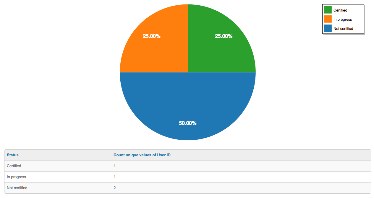
I was able to reproduce the issue with ‘half’ pie charts you showed. It occurred because of the choices you made on the ‘Graph’ tab when constructing the chart. For pie charts, the ‘category’ represents the field which will make up the segments of the graph (and are also shown on the legend). You chose ‘Is certified’ which only contains two values “yes” and “no”. For pie charts these values are expected to be unique, but in your case there are multiple “no” values, so only the first one is used. The data series represents the count of the items matching the category you selected. I think we should either support multiple identical values in the category for pie charts, or if that is not possible print an error explaining why we can't. I have opened TL-7676 to cover that.
To get the graph you want you need to think about what you would like the data to look like to represent the values you are after. In this case it would be more like this:
| category (pie slices) | data series (number of items for matching slice) |
| Certified | 1 |
| In progress | 1 |
| Not certified | 2 |
To achieve this the status column must shown the actual status (not the count of status), and you need a column with the count of the number of records with that status. If you are expecting each user to only complete each certification once the easiest way to do that would be "Unique Count of User ID”. So the final setup I used is:
- certification completion report source
- columns tab:
- Status
- Count unique of User ID
- graph tab:
- type: pie
- Orientation: data series in columns
- Category: Status
- Data sources: Count unique values of User ID
Which gave this result:
The other issue here is that you have left a lot of unrelated columns in the table which is being used to generate the graph. It is best to remove columns that are not directly related to the graph as they can have an unintended impact on aggregation. This is explained in more detail with examples here:
http://help.totaralms.com/index.htm#Report_Aggregation.htm
In your case including the user’s name and the certification name is not what you want if you want to aggregate by status, because having those unique values will prevent aggregation across multiple users and certifications.
I do acknowledge that the current system makes it much harder than it should be to quickly generate the graphs that you need. I think there are a number of changes needed to resolve that including:
- Fixing the issues I found today
- Providing much better documentation on how the system works
- Providing a set of common graphs out of the box, which allow you to quickly produce graphs for common scenarios, but also give some examples that you can view and modify easily.
- Separating graph generation from the tabular data view, so you can product standalone graphs that are separate from the data view.
- In some cases, add additional columns to make common graphs easier to generate
- Improvements to the usability of the graph generation as a whole
Simon
This forum post has been removed
The content of this forum post has been removed and can no longer be accessed.
This forum post has been removed
The content of this forum post has been removed and can no longer be accessed.
Re: Charts in General and Pie charts specifically
For 1, see my answer below.
For 2, if you just want to count the number of signups, independent of the booking status, you could do this:
Columns: Course category or organisation, count of user id (rename to "number of signups")
Graph: Type: Columns, Orientation: Series in Columns, Category: Course category or organisation, Data series: number of signups
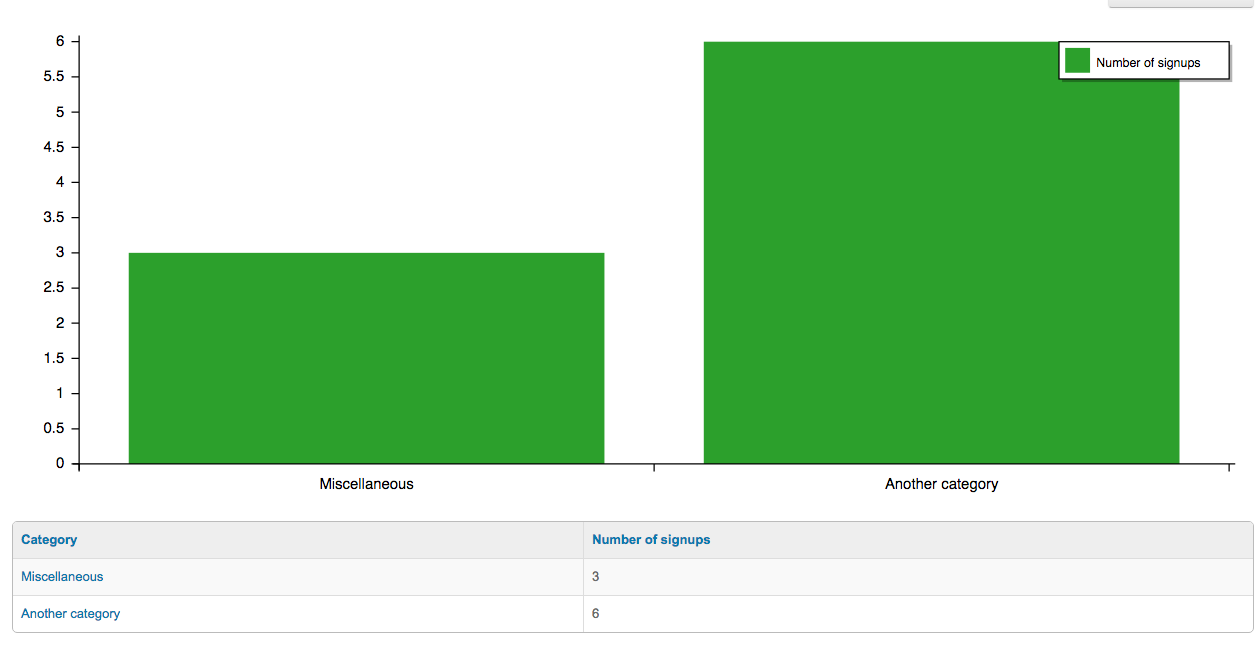
If you wanted to show only signups of a specific status (say booked only) you would have to create a saved search with your search rules applied afterwards.
For 3, we don't currently have a gradebook report source so that one isn't possible. Because the calculation of grades can be extremely complex (requiring very complex logic) it is fairly unlikely that we'll be able to produce a purely SQL-based grade report that could handle all the features supported by gradebook.
For 4, I used the program completions source:
Columns: User's organisation name, Sum of "Is complete?" (renamed to Number of completions)
Graph: Graph type column, Orientation: Series in columns, Category: User's organisation name, Data series: Number of completions
Simon
This forum post has been removed
The content of this forum post has been removed and can no longer be accessed.