Best practice forum (Archived)

Couple "Basis" Theme questions

 
John Unnever
Couple "Basis" Theme questions
by John Unnever - Friday, 10 February 2017, 4:22 PM
Group Partners

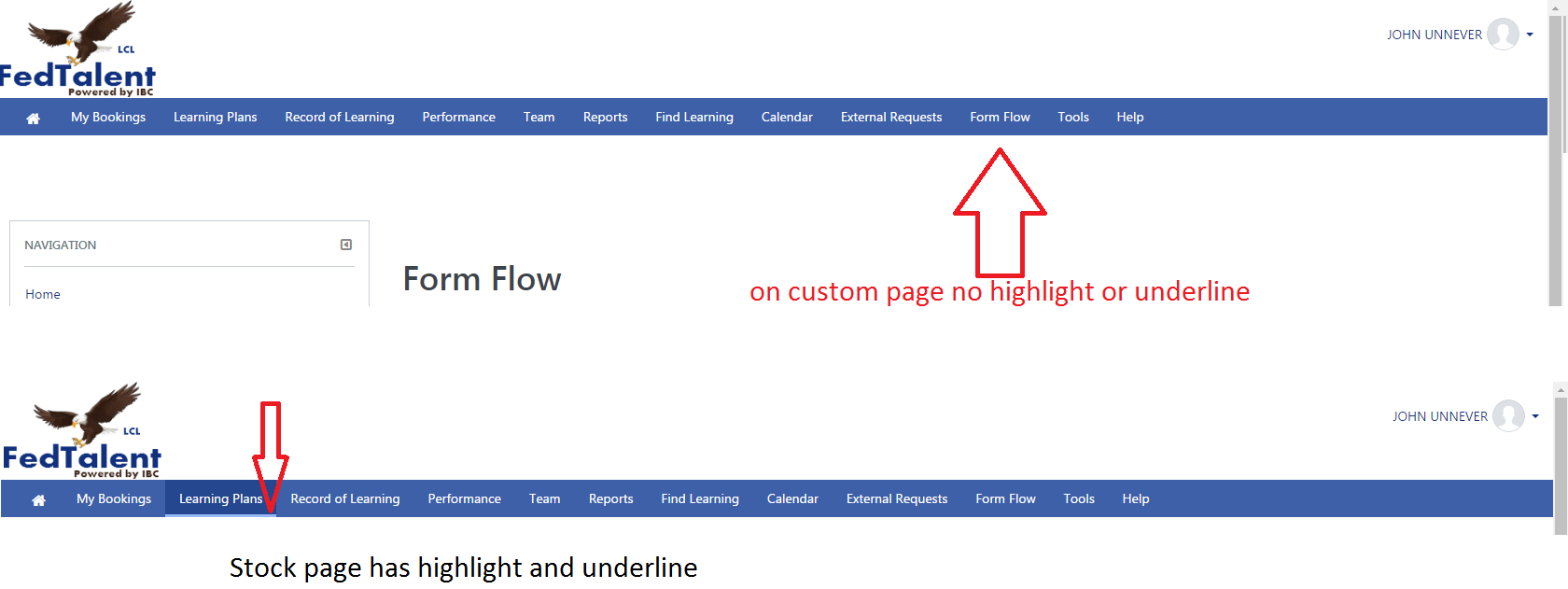
I noticed that with the new basis theme, the size of the logo has shrunk.  This is making some text in our logo now unreadable.  Is there an easy way to have this area not scale the logo down so much?  I've got it working through a bunch of css modifications but was just curious if anyone might know of a better / easier way?

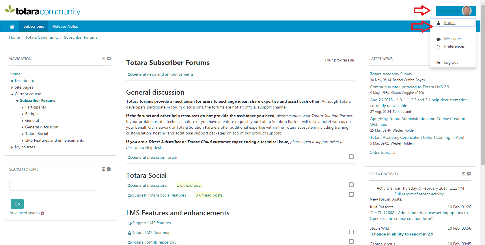
Secondly, the user control panel in the top right of the site where you can go to edit your profile, messages, preferences, logout..  i noticed 2 things. One, when highlighted, the bg color that highlights your name then makes the link text of your name difficult to read..   And lastly, there is a colored border around the "Profile" option .. i noticed this on your community site as well and i have attached a screen shot of it to show you.  Just curious if these were intentional.. and if not, thought maybe they could get a small tweak in a future release.

Thanks for your time..


John Unnever
Re: Couple "Basis" Theme questions
by John Unnever - Friday, 10 February 2017, 4:46 PM
Group Partners

One more thing..  i noticed that custom menu pages don't have the highlight or underline theming.  Is this true or is my build got something wonky going on?


Joby Harding
Re: Couple "Basis" Theme questions
by Joby Harding - Monday, 13 February 2017, 4:09 AM
 
Hi John,

Thanks for your post.

Yes the logo area is slightly smaller in Basis. If you need to increase this then customising via CSS or LESS is correct. Using the .navbar-site .navbar-brand selector and overriding the height should be all that is required (as logo should increase in size proportionately) but as with any style change be sure to give it a thorough test.

The outline around the profile link is browser default styling (for example on Firefox this shows as a light dotted line) showing that item has been given focus. The first item receiving focus after opening the dropdown is so that it's possible to navigate through using the keyboard / assistive technologies. If you hit tab you should see that focus proceeds through the dropdown items.

The background colour behind the avatar as you note isn't correct. It is being set using the following selector

.jsenabled .usermenu .moodle-actionmenu.show

...when custom colours are enabled via the admin settings. I'll open a ticket to get this looked at.

In terms of the main menu active item underlining we already have an open ticket to investigate this so I've updated it to note your mention of it here.

Kind regards,

Joby