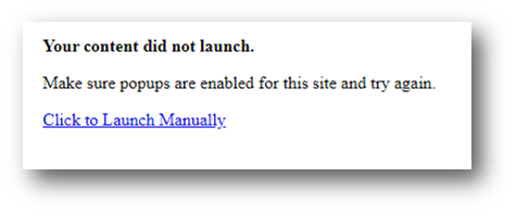
As a follow-up to my original post, I'd like to note that we prefer to avoid opening any new windows for SCORM activities. Instead, we would prefer to open the activity in the current window.
Although Totara offers a "Current Window" option, it does not seem to implement the SCORM settings in a way that allows granular control of the SCO presentation. As a result, the content is displayed in a frameset surrounded by other UI elements that have nothing to do with the course navigation. This negatively impacts our course UI/UX, especially on mobile devices, and makes it very likely that learners will inadvertently navigate away from the course content.
We're migrating from an LMS that allows content authors to control precisely how SCOs are launched, including which navigational elements are available and hidden. Essentially, we're used to a configuration exactly like the one you test a SCO on Rustici's SCORM cloud website.
Is this an issue that other course designers have faced? Is there any way to mitigate the issue?
